A UI Text Layout in VR Simulation based on Field of View
Young Jick Jang, Nak Hyeon Ku, Tae Soo Yun
Department of Visual Contents
Graduate school, Dongseo University
Busan, South Korea
jyj8654@gmail.com, rnskrwl1@gmail.com, yntaesoo@gmail.com
Abstract
We proposes a UI text layout for VR simulation production and assesses its usability as a means of verifying feasibility. Human viewing angle is considered to select a UI text layout model in an advance study of the field of vision in VR environment and types of layout model based on UX. This forms a guideline for UI text layout for VR which identifies Area A for main content, Areas b for other information and Area c background area. This guideline is then applied to a VR simulation for automobile safety training in order to build a prototype. An experiment is conducted to assess usability and verify reliability. This paper thus provides a useful source for VR simulation design and production.
Keywords-VR Simulation: Field of View; UI/UX
1. Introduction
There has been a constant stream of VR simulation for safety education and training. And since VR simulation for safety training has educational purposes such as the provision of basic information, provision of professional information as well as the provision of information on special circumstances, UI/UX design should be capable of conveying accurate information. In particular, UI text design guideline which most effectively delivers accurate information to user is an importance reference source for the design and production of VR simulation. And yet, there is currently UI text guideline to speak for the delivery of text in safety training VR simulation; research in the area is equally lacking. This paper thus proposes a UI text layout as a first step to building UI text guideline; the guideline is then applied to a safety training VR simulation produced by the authors to verify usability through experiment.
2. UI Text Layout in VR Simulation
UI text production for VR simulation must consider human viewing angle. If such consideration is not made in a 360-degree VR environment, the user may suffer from VR sickness and nausea. UI text design should involve layout design based on UX design guideline.
2.1. FoV and UFoV in VR Environment
Human Field of View, has a range of 200 degrees horizontally and 130 degrees vertically; but when concentrating on a point, range of cognition narrows down to about 3 degrees. When seeing a display with both eyes, viewing angle is 62 degrees in both left and right directions. Here, viewing angle for character identification is 10-20 degrees; 5-30 degrees for mark identification; 30-60 degrees for color identification. [1] Thus UI text should be placed within the area of character identification (10-20 degrees), mark identification (5-30 degrees) and color identification (30-60 degrees). This is shown in the left diagram in Figure 1 below.
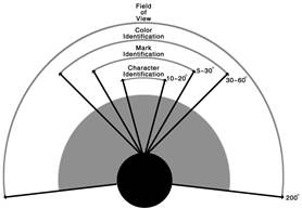
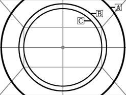
Fig 1. Left)Human FoV, Right)FoV in VR Environment
Based on human field of view, then, field of view for VR simulation which is experienced through HMD should be determined. This is as shown in the right diagram in Figure 1. There, A represents human field of view(FoV) which has a viewing angle of 200 degrees horizontally and 130 vertically. B represents useful field of view(UFoV) which ranges over 30 to 60 degrees where color identification is possible; C is instantaneous field of view(IFoV), ranging over 10-20 degrees left and right, where instantaneous character identification is possible. Thus key content should be placed within IFoV to allow instantaneous delivery of information. Additional information such as marks and colors should be placed within UFoV other than IFoV so as to increase the visibility of IFoV; in other areas of FoV, close and far views can be placed.
2.2. Types of Layout based on UX
UI design is effective when based on UX design. It is possible to identify 8 types of layout based on UX. Lateral-downward type provides information in the same way one reads a book; radial type has central element surrounded by sub-elements; top-down type places high-level element at the top and low-level elements underneath; tree type divides elements into categories; central type has key element in the center; upper space type is similar to movie screens at cinema; area proportional type expresses the importance of an element through its size in space; proximity type places elements close or far depending on their qualities.
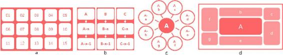
Fig 2. a) lateral-downward, b) downward, c) radial, d) central
Since UX design must clearly define the characteristics of content elements and their relationships so as to determine the type of layout to be used. [2] Thus lateral-downward, downward, radial and central types have been selected because they provide information and encourage action; finally, central type is chosen for UI text layout design because it is closest to the aforementioned human field of view.
3. Vehicle safety VR simulation: UI text layout design
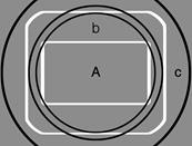
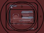
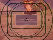
This paper seeks to assess automobile safety training VR simulation. This simulation provides simulated experience of automobile accident situations so as to train the user to respond to such situations. Four accident situations are offered; drowning, accident in the rain, fire and speeding accident. Such VR simulation, compared to real-life training for automobile accident response, is more efficient in terms of safety, economy and repeatability. The aforementioned FoV and UI text layout based on UX design guideline is as shown in the ‘layout’ section of Table 1. The area of IFoV, which is A in the UX layout of central type allow for intuitive cognition; thus key information, mostly textual, is placed there. B, which is the rest of UFoV that is not IFoV, is used for supplementary information, mostly marks and colors. The rest of FoV is C where close and far views are positioned. The result of applying such layout design to automobile safety training VR simulation is shown in ‘VR Simulation Application’ in Table 1. The first photo shows a menu screen where the user can select an accident situation scenario. An area has texts such as indirect experience, drowning accident, accident in the rain, fire, speeding accident. B area has design elements using marks and colors, namely a link to move back. C area is set black so as to increase the delivery impact of A and B. The second photo shows a scene from training for fire accident. An area has the most important piece of information, namely ‘how to use a fire extinguisher in response to a vehicle fire situation.’ B area contains objects like a car on fire and a fire extinguisher. C area shows close and far views whose chroma is lower than objects in B area so that the user can focus on A and B.
Table1. UI text layout guideline and its application
|
Layout |
Application to VR simulation |
|
|
|
|
|
4. Methodology and Results for Usability Evaluation
The reliability of Vehicle safety training VR simulation, developed using UI text layout proposed in this paper, was assessed through an experiment for usability Evaluation.
4.1. Methodology for Usability Evaluation In VR simulation
Methodology for usability Evaluation for training or educational VR simulation was based on walkthrough method set out by Sutcliffe (2000). Here, three categories are proposed; objective-oriented task execution, exploration and navigation in virtual world; and interaction under system design. [3] Questions were developed accordingly with wording modified to relate UI text layout in VR simulation under study. 30 adults with basic understanding of automobile safety and without difficulties in operating VR simulation were chosen to participate in the experiment.
Table 2. Survey questions for Usability Evaluation
|
Category |
Questions |
|
Objective-oriented Task execution |
Could you accurately understand the objective of task? |
|
Could you use task information to respond to accident situation with immediate confirmation and action? |
|
|
Could you easily confirm the outcome of task execution? |
|
|
Exploration and navigation in the virtual world |
Was it easy to operate interface with text information? |
|
Could you accurately recognize positions of text information? |
|
|
Could you freely input variables provided by text information? |
|
|
Interaction under system design |
Was text information well delivered visually? |
|
Could you recognize and operate objects designated by text? |
|
|
Weren’t there any nausea or VR sickness during simulation? |
After working through the VR simulation, participants were asked to answer survey questions on a five-point scale. In order to increase the reliability of survey, participants were also interviewed after survey to hear their qualitative feedback. Table 2 shows survey questions for usability assessment.
4.2. Usability Evaluation Results
Scores on usability assessment survey were on a five-point scale down to one decimal point. First, on objective-oriented task execution, understanding of task objective scored 4.6, which points to high usability. During in-depth interview, participants mentioned that basic information, current situation and instructions for response were presented in UI text in a simple manner which allowed for intuitive perception. While they also mentioned that they were able to confirm the outcome of task execution immediately, immediate confirmation and action in response to accident scored a relatively low score of 3.8. On this, participants added that at least of some of this was because they were not familiar with VR environment and hardware. On exploration and navigation in virtual world, when asked about the ease of interface operation participants gave a relatively good score of 4.3. In comparison, cognition of current position and variable input scored rather low at 3.1 and 2.8 respectively. One participant pointed to difficulties in getting used to VR environment as well as an element of panic in response to an accident situation. Finally on interaction under system design, visual cognition of text information and interaction with objects designated by text both scored high at 4.8 and 4.1 respectively. One participant further commented that UI text in simulation was simple, allowing for immediate and intuitive cognition. In contrast, when asked about nausea and VR sickness, participants returned a rather low average of 3.2; but given rather large variance among participants, it may be conjectured that feelings or nausea and VR sickness is largely down to individuals. A summary of usability assessment results is given in Table 3 below.
Table 3. Usability Evaluation Results
|
Five-Point Scale |
Category |
Average Score |
|
Very useful - 1 point Fairly useful – 2 points Useful - 3 points Not really useful – 4 points So not useful - 5 points |
Objective-oriented task execution |
4.6 |
|
3.8 |
||
|
4 |
||
|
Exploration and Navigation in virtual world |
4.3 |
|
|
3.1 |
||
|
2.8 |
||
|
Interaction under system design |
4.8 |
|
|
4.1 |
||
|
3.2 |
5. Conclusion
This paper proposed a UI text layout guideline for VR simulation based on human FoV and UX layout guidelines. It was then applied to the development of an automobile safety training VR simulation, subject to a five-point scale usability assessment. The results show that the proposed UI text layout enables accurate information delivery, improves visual cognition and facilitates easy interface operation. It was also noted that, through assessments on adaptability to VR simulation and experience of nausea and VR sickness, there remains a challenge in accessibility, popularity and understanding of hardware. The study also highlighted needs for further research on the elements of UI text guideline other than layout. First, what’s the appropriate color for UI text? Second, how should colors be differentiated for key content, sub-elements and background? Such questions will require follow-up research which in turn will make meaningful contributions to developing a UI text guideline in VR simulation.
References
[1] R. Patterso n, M. Winterbo ttom, B. Pierce, Perceptual Issues in the Use of Head-Mounted Visual Displ ays, Vo l.48, No.3, H uman F acto rs: The Journal of the Human Factors and Ergonomics So ciety, 2006.
[2] K. Kyung Hong, The key to make everything look better UX design, GilBut Publishers, 2014.
[3] A.G.Sutcliffe, K.Deol Kaur, Evaluating the Usability of Virtual Reality User Interface, Behaviour and Information Technology, Vol.19, No.6, pp.415-426, 2000.